Bare Earth
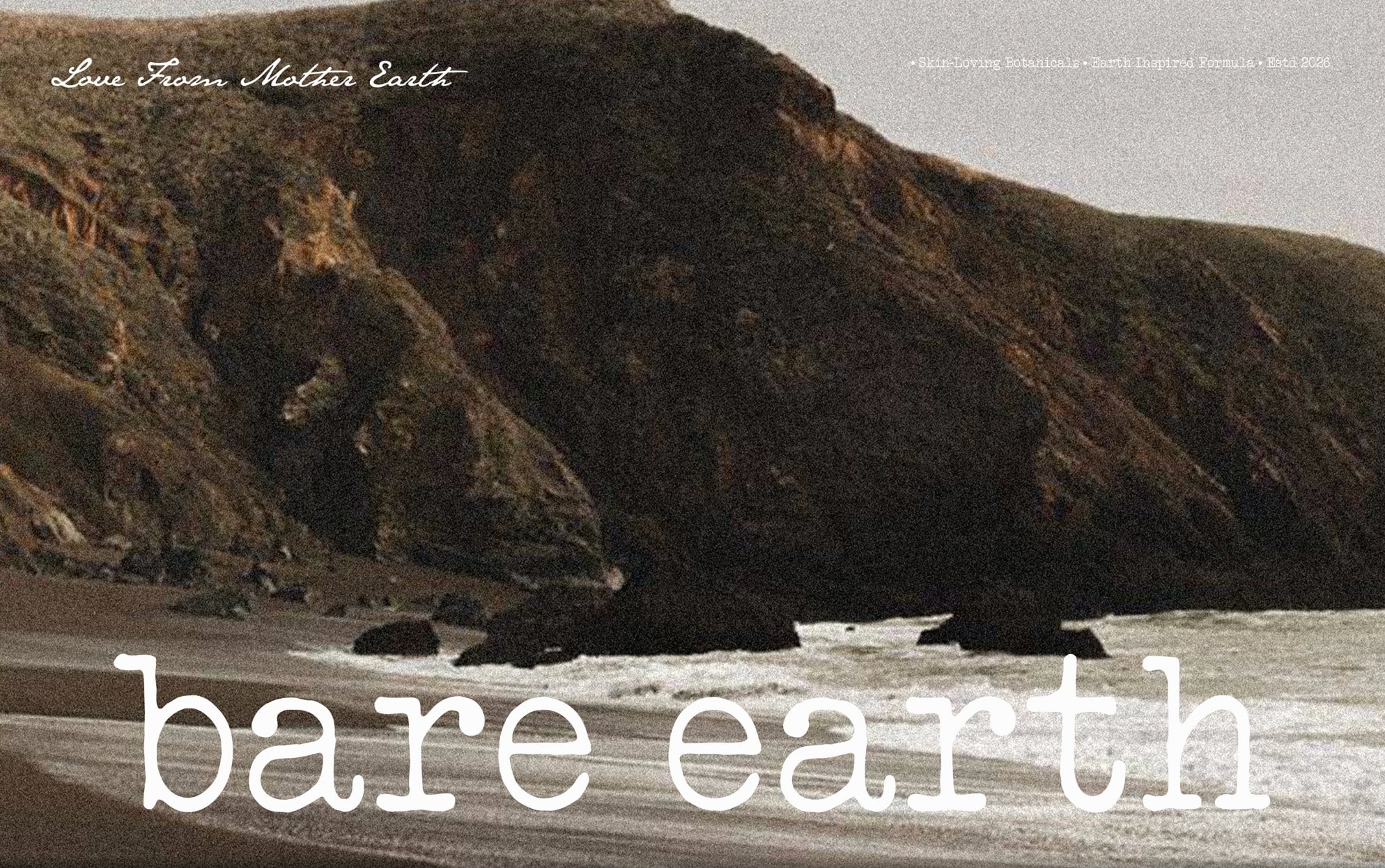
Minimal body care, love from Mother Earth. A typewriter wordmark, an earth palette and packaging that reads like a field label.
- CLIENT
- Bare Earth
- CATEGORY
- Body care
- YEAR
- 2026
01 · THE BRIEF
Closer to a botanist’s notebook than a beauty counter.
Bare Earth makes plant-based body care rooted in the landscape it is named after.
The identity had to feel raw and honest, and stay calm across a growing range.
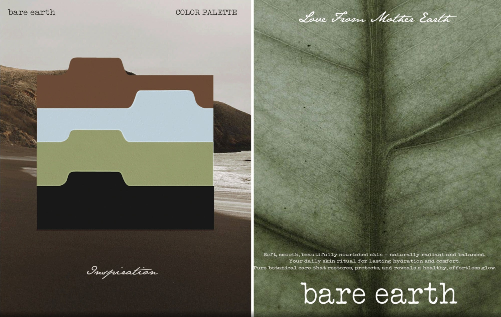
02 · PALETTERun from sky to earth.
Sky
Stone
Sage
Sand
Soil
Bark
Charcoal
03 · IDENTITY
A typewriter wordmark and a b.
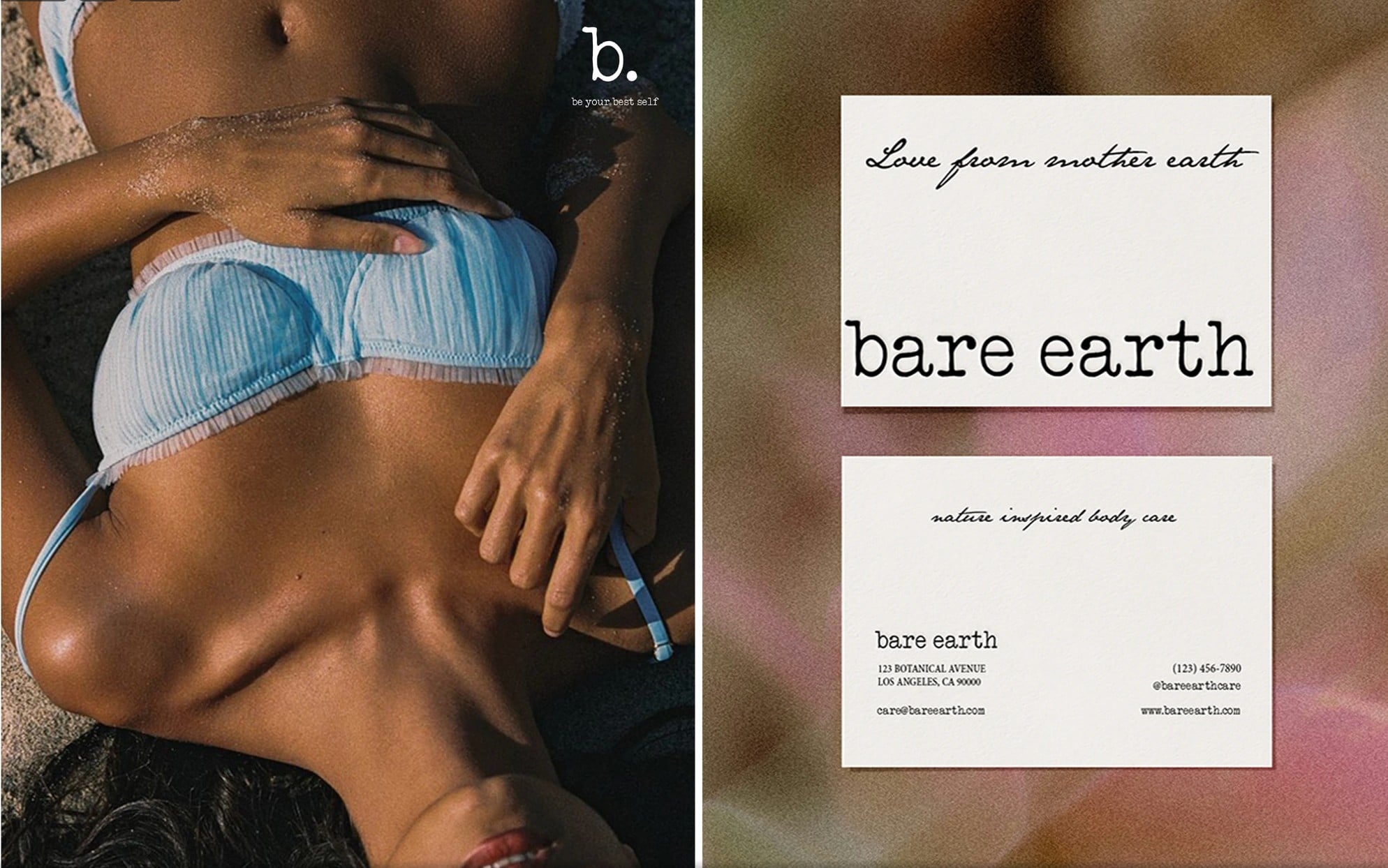
Set in a worn typewriter face, so it reads like something written rather than designed. The b. shortens it for seals, stickers and boxes, with “Love From Mother Earth” as the signature.
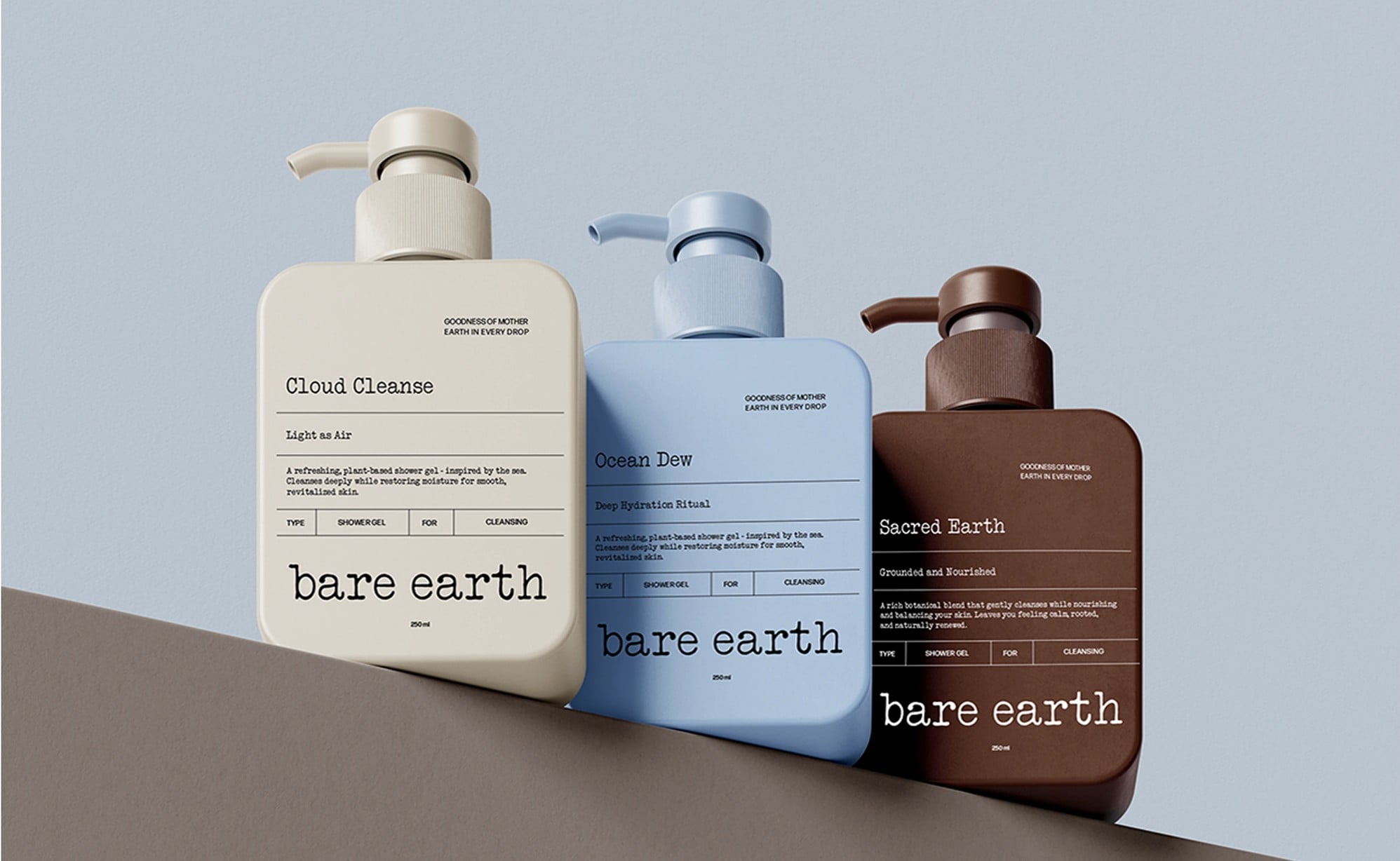
Labels like field notes.Every bottle carries the same ruled label: product name, ritual, a short description and a type and use table.
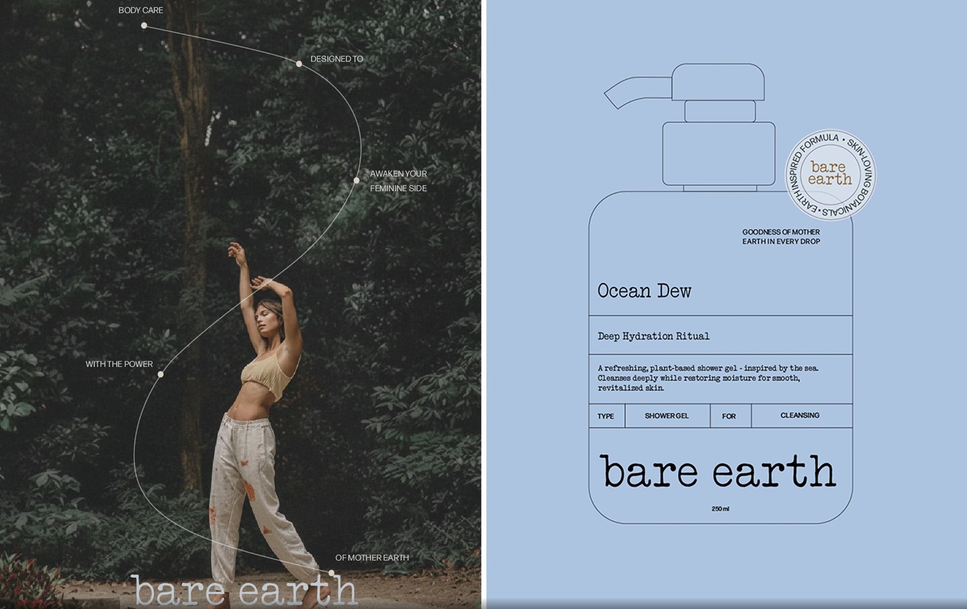
Campaign with room to breathe.Imagery shot outdoors, with the line traced through the frame and the wordmark set low.
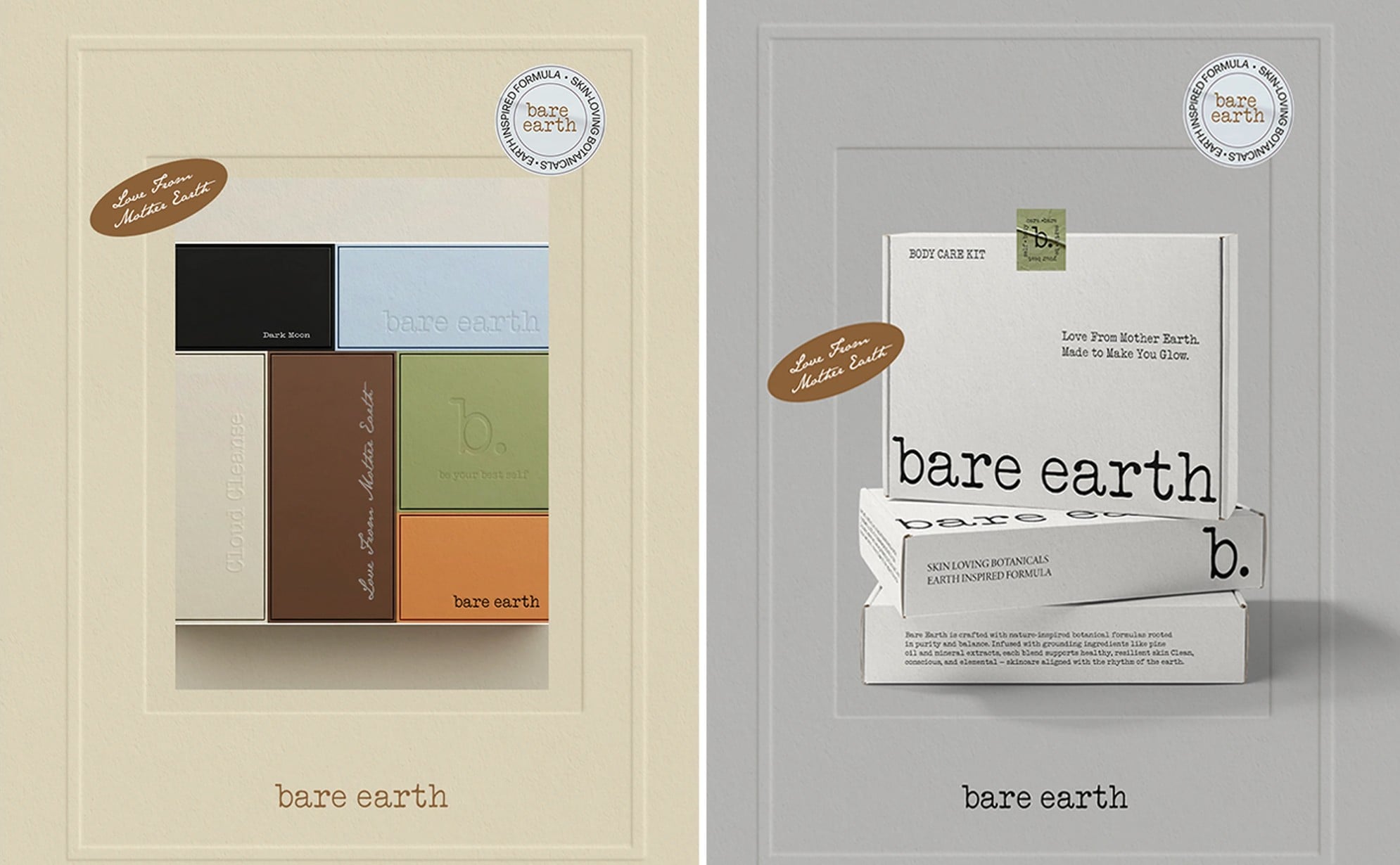
A box you keep.Debossed boards in the earth palette, a body care kit mailer and a seal.
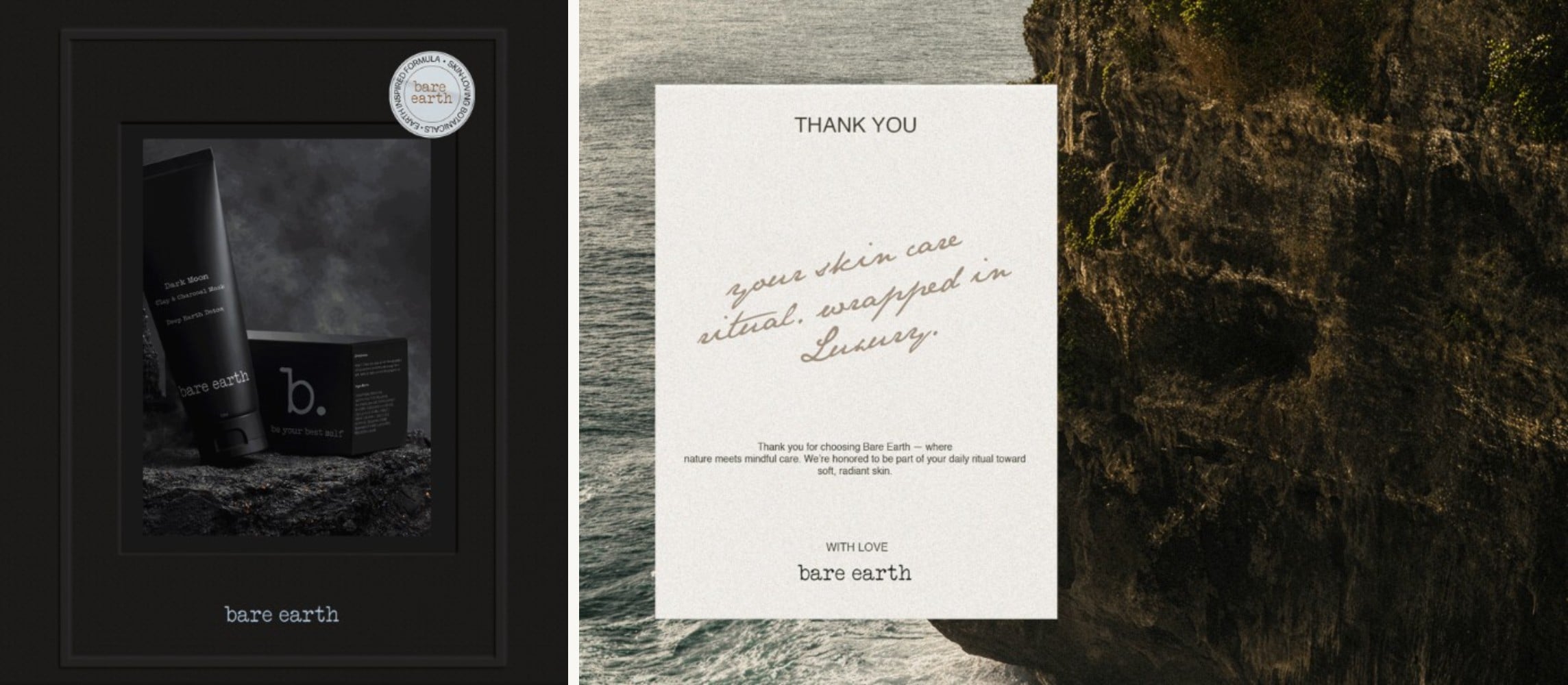
Dark Moon.The clay and charcoal mask gets the palette’s black, shot on volcanic rock.
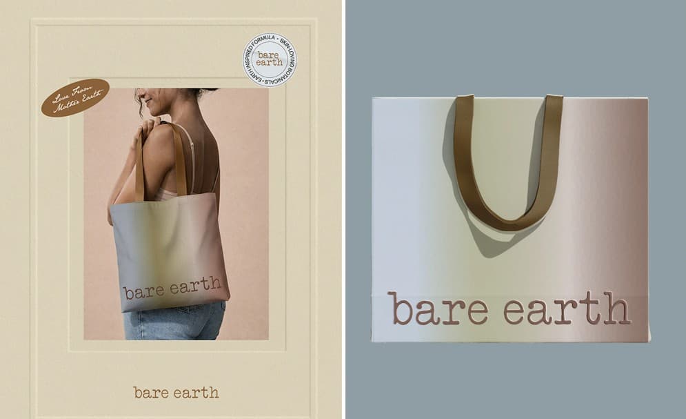
Carried out the door: a gradient tote that runs the palette from sky to earth.
Kimberly TcheBrand identity
Year2026Services
Brand identityPackaging