Mark Collins PR
Not your usual PR agency. A custom typeface and identity for an independent entertainment PR agency.
- CLIENT
- Entertainment PR
- MARKET
- UK
- FOUNDED
- 2014
- SITE
- markcollinspr.com
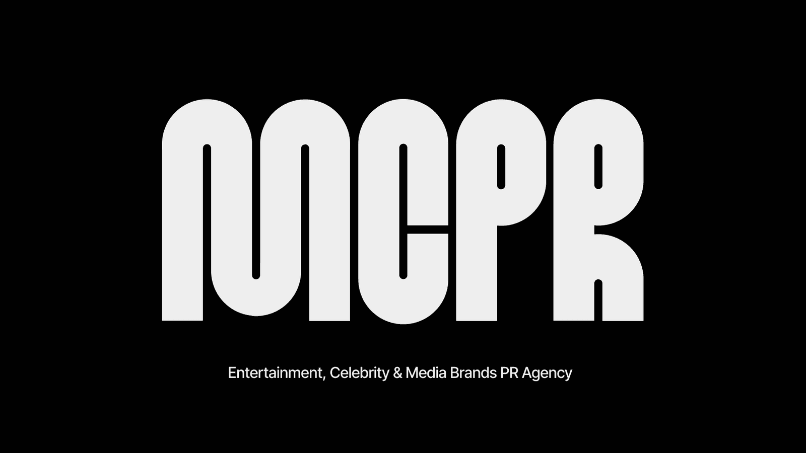
01 · THE BRIEF
Not your usual PR agency.
MCPR works across TV and streaming, media brands, kids and family, and celebrity PR, for clients from the BBC to National Geographic and Disney.
Their work is about moments people talk about. The brand needed to feel like one: loud, warm and a bit unexpected.
02 · THE TYPEFACE
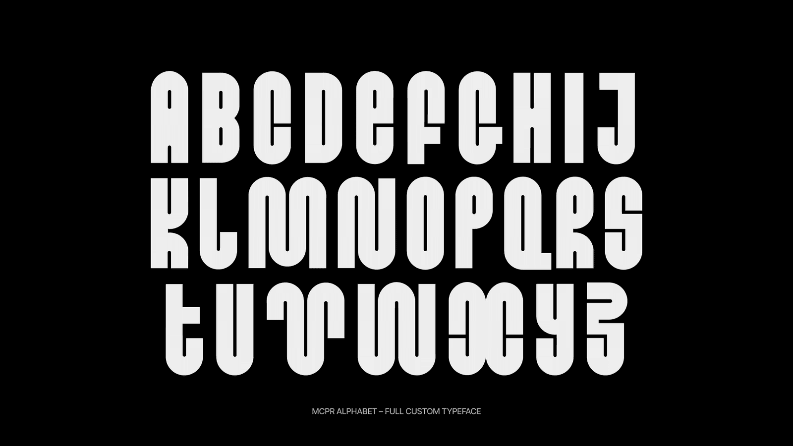
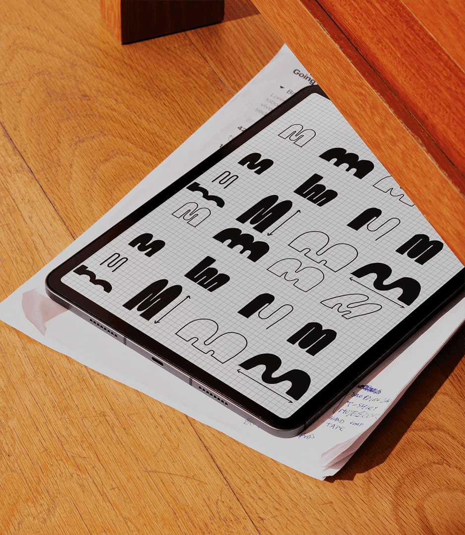
A typeface built from one shape.
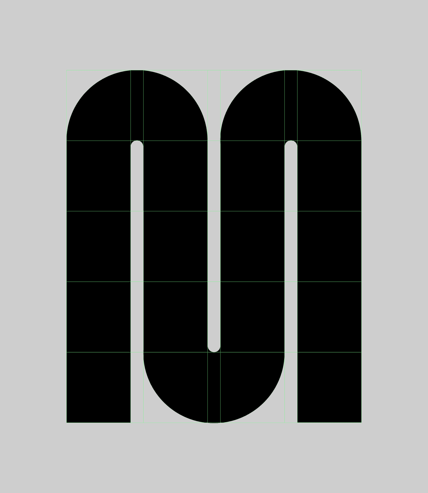
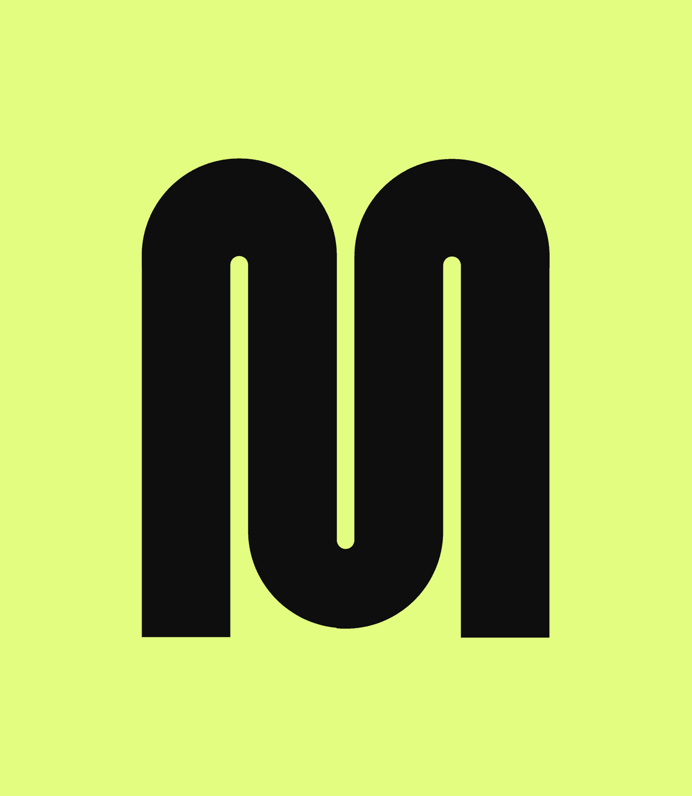
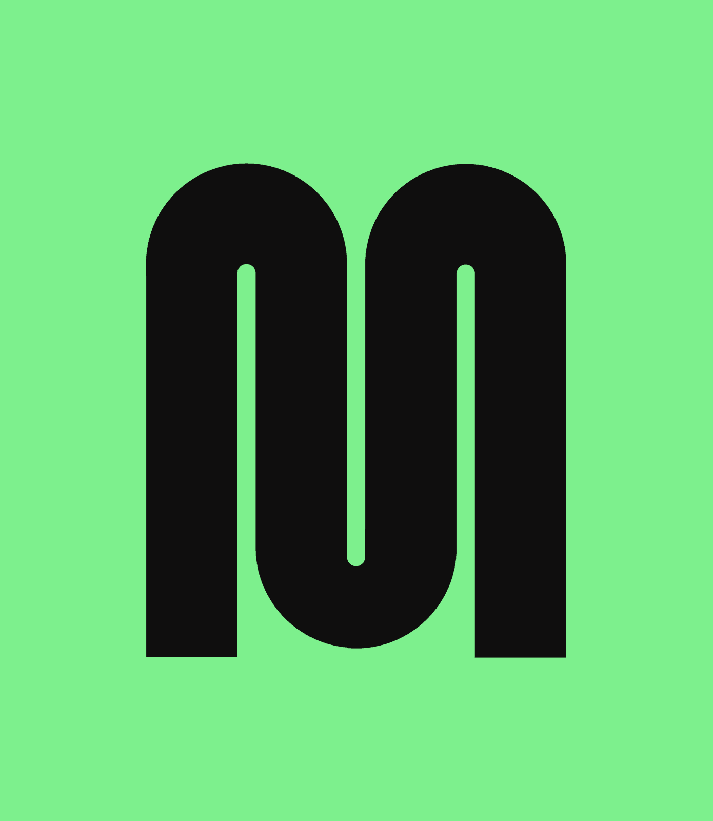
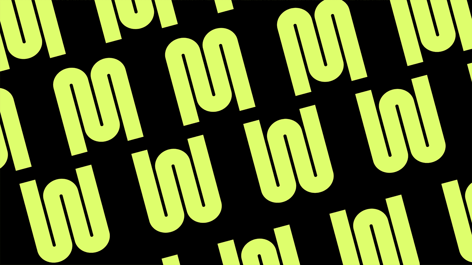
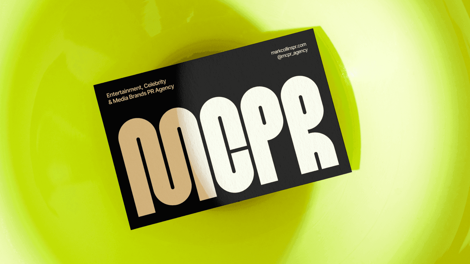
Every letter is drawn from the same rounded arch, so the alphabet reads as a family and the M becomes the mark on its own.
03 · PALETTEAcid lime against black.
Lime
Mint
Black
Bone
04 · APPLICATIONS
An identity that talks back.
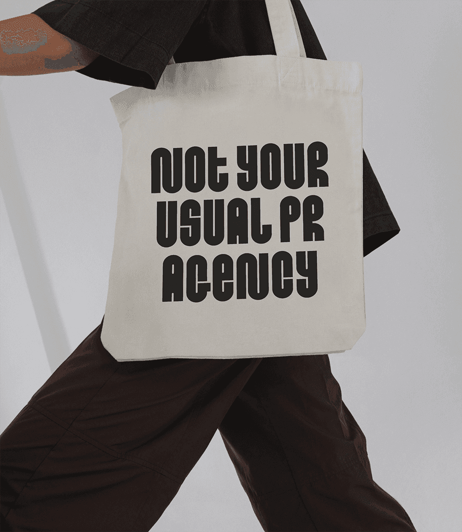
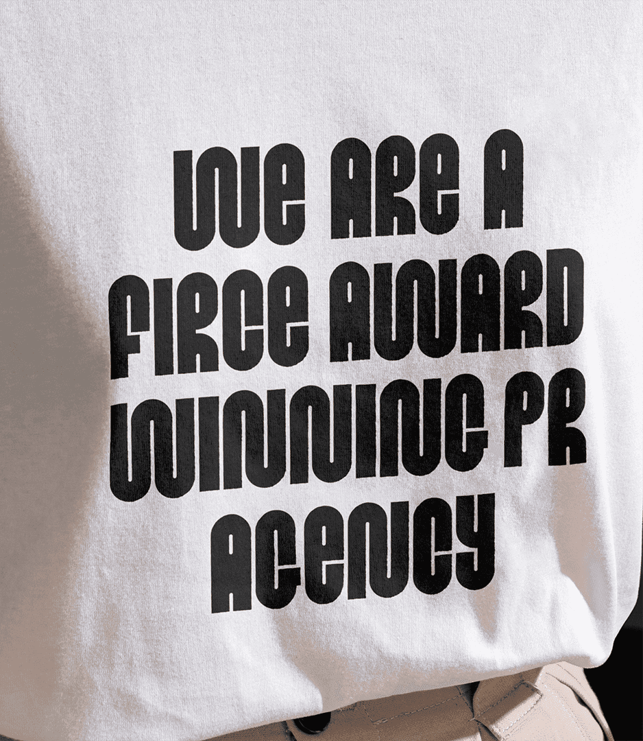
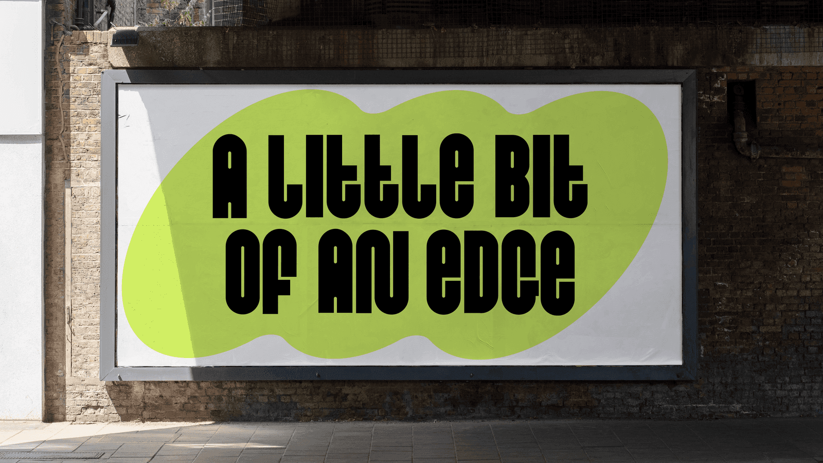
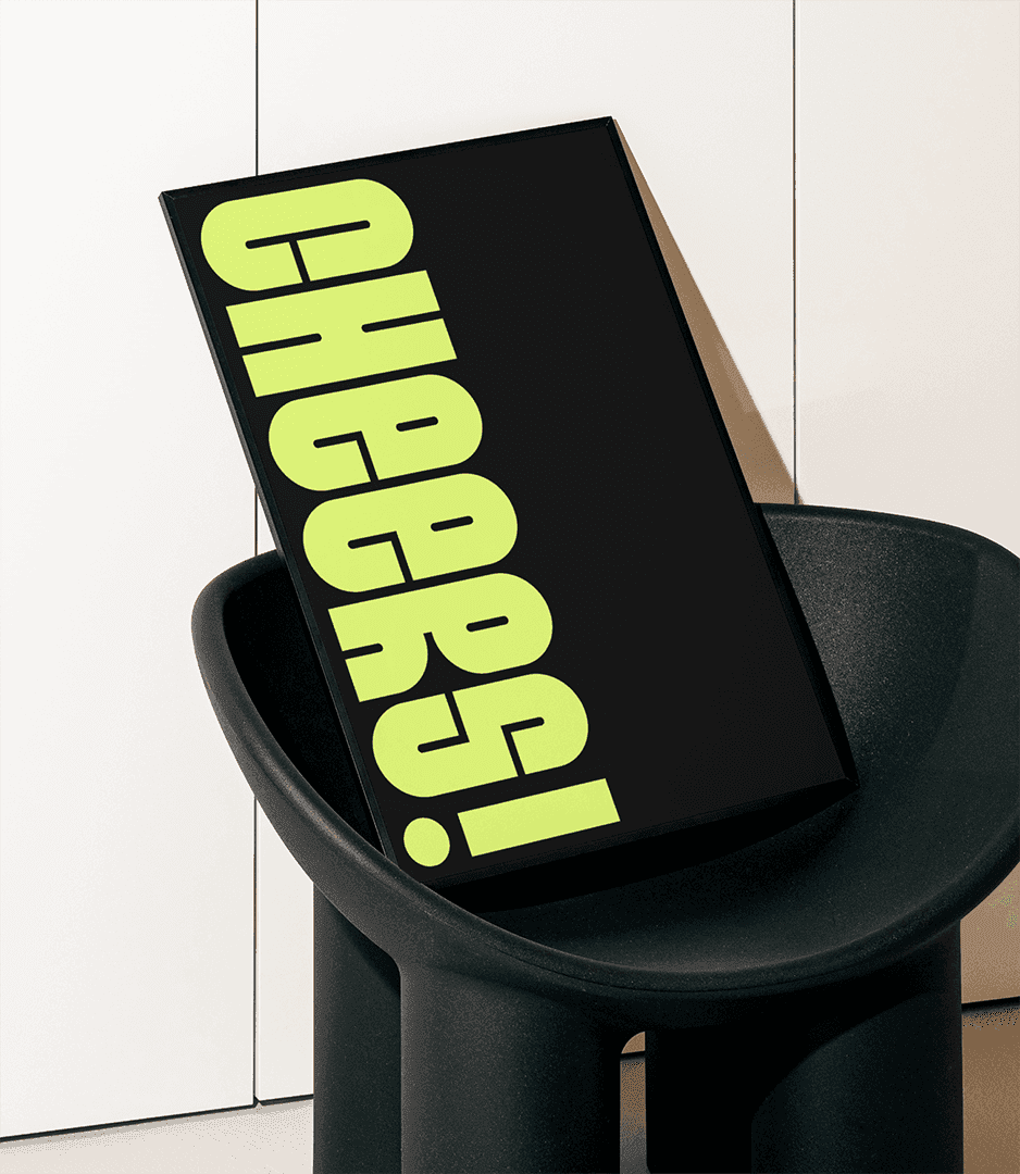
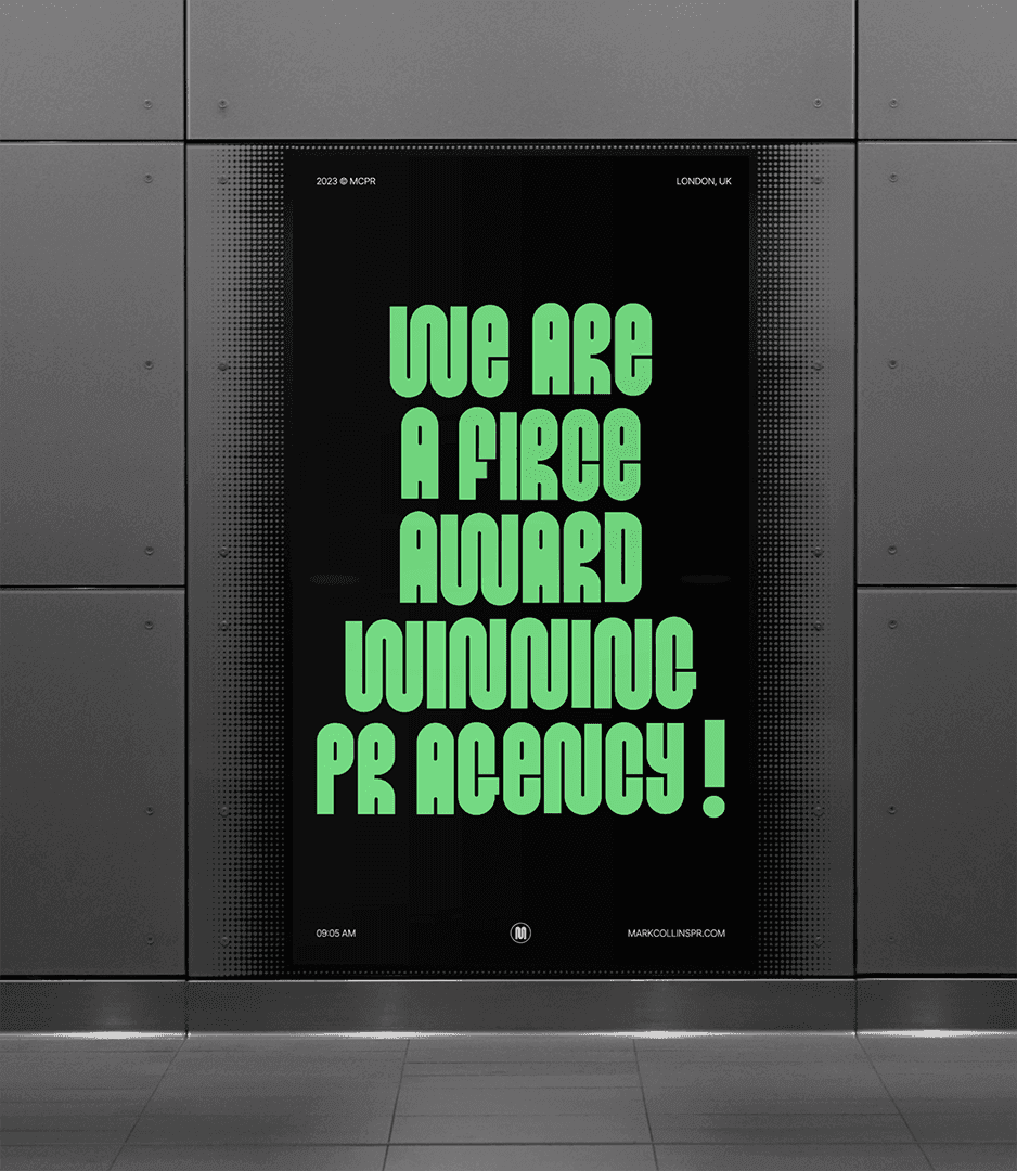
Short lines set big: “Not your usual PR agency”, “A little bit of an edge”. On totes, tees and posters.
05 · WEB + SOCIAL
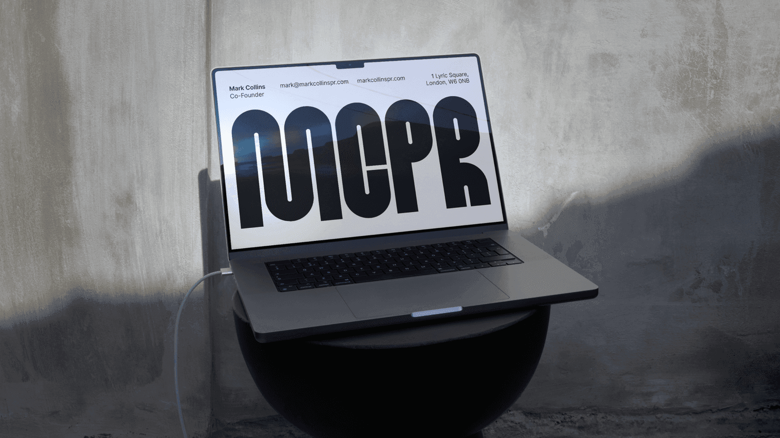
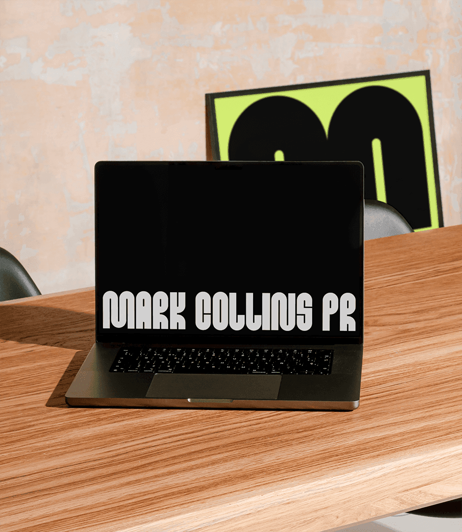
A website with the same voice.
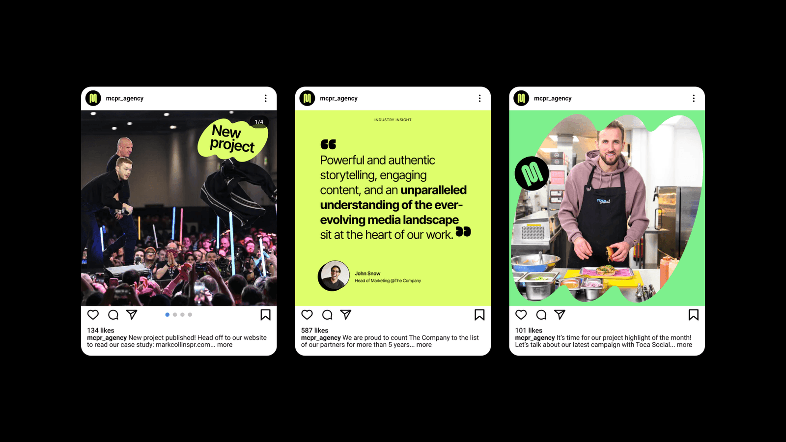
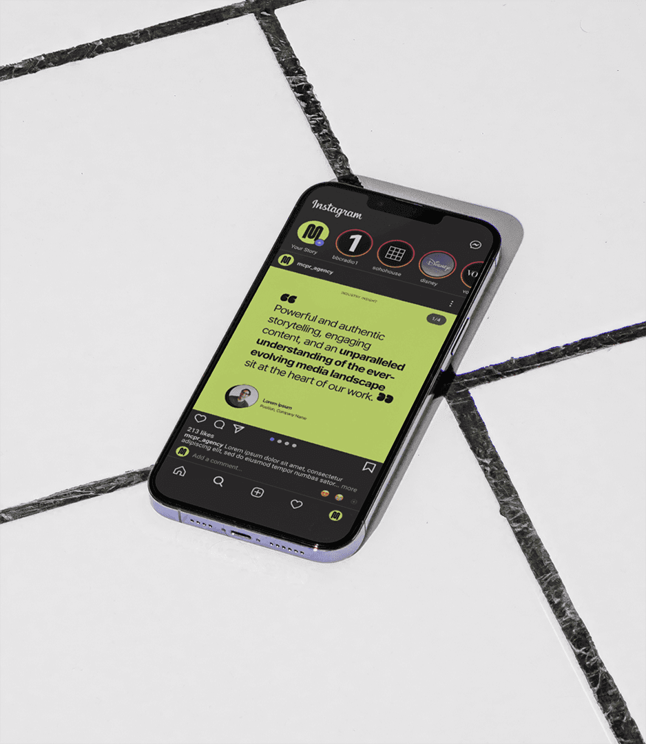
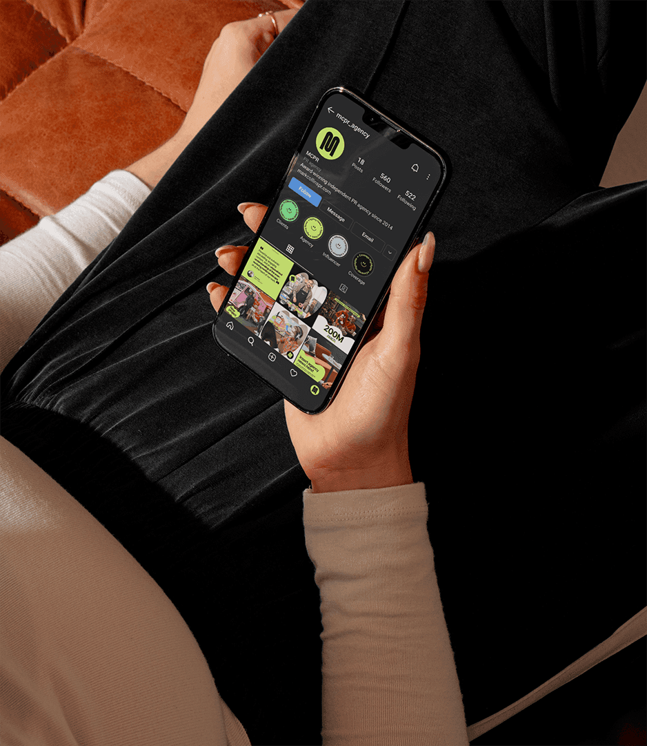
Designed and built to carry the type at full size, with case studies and press moments front and centre. Social templates run on the type and the lime.
Kimberly TcheStrategy, brand identity, web design and build, content
Prost StudioType and brand identity
Type ThursdayFeatured
YearServices
IdentityTypeWebsite