Tiiwara
A womenswear design studio exploring colour through the working wardrobe. Identity, colour system, packaging, website and launch.
- CLIENT
- Womenswear
- MARKET
- London
- YEAR
- 2026
- SITE
- tiiwara.com

Considered colour
for the working wardrobe.
01 · THE BRIEF
A design studio that publishes.
Too many women feel they have to become less themselves when they get dressed for work.
Tiiwara answers with considered colour: every shade carries a Pantone reference, a fabric weight and a reason to exist.
02 · THE MARKSA wordmark and an ii.
Rounded and forward-leaning. Labels, mailers, the site and campaigns.

The double i lifts out as the mark on its own, for seals, stickers and the smallest sizes.
03 · TYPESpecs are the love language.
Colour at workHeadlines, campaign titles and colour names.
PANTONE 16-5127 TCX
310GSM RIB
DEVELOPED OVER 7 SAMPLESThe reference, the weight and the sample count, the way a gallery writes wall text.
04 · COLOUREvery shade has a reference.
Slate
Powder
Paper
Aubergine
Sky
Cobalt
Yellow
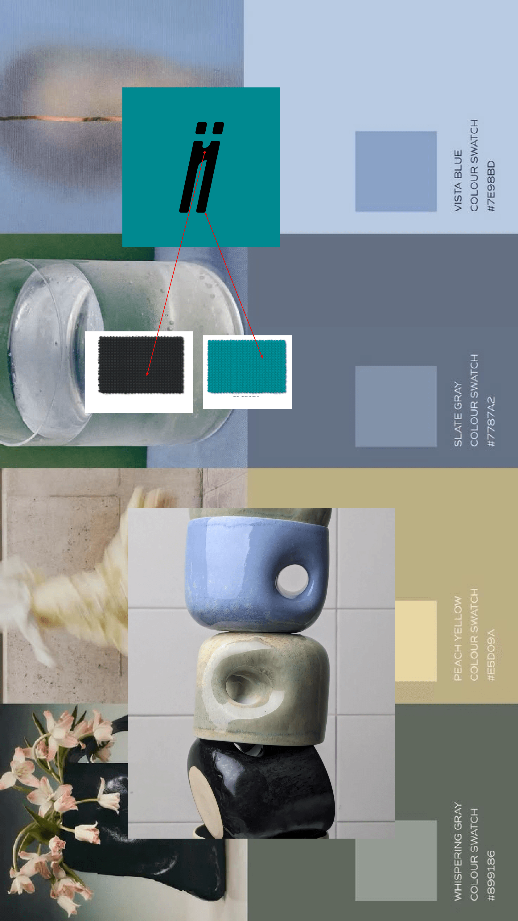
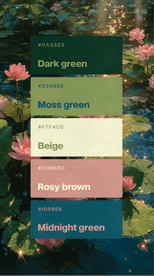
Colour with a Pantone reference.Research pairs launch limited and then archive, each with its mill number and its story.
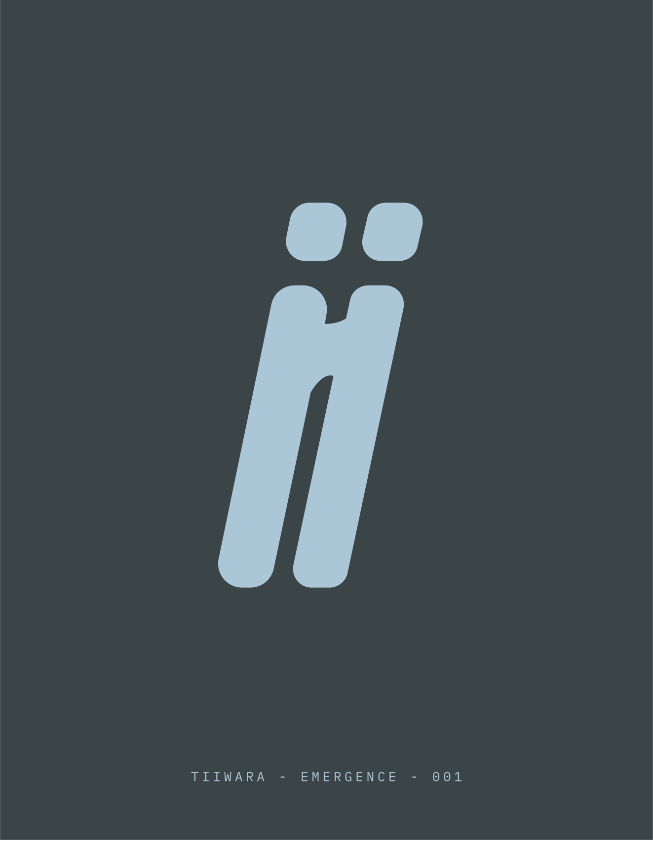
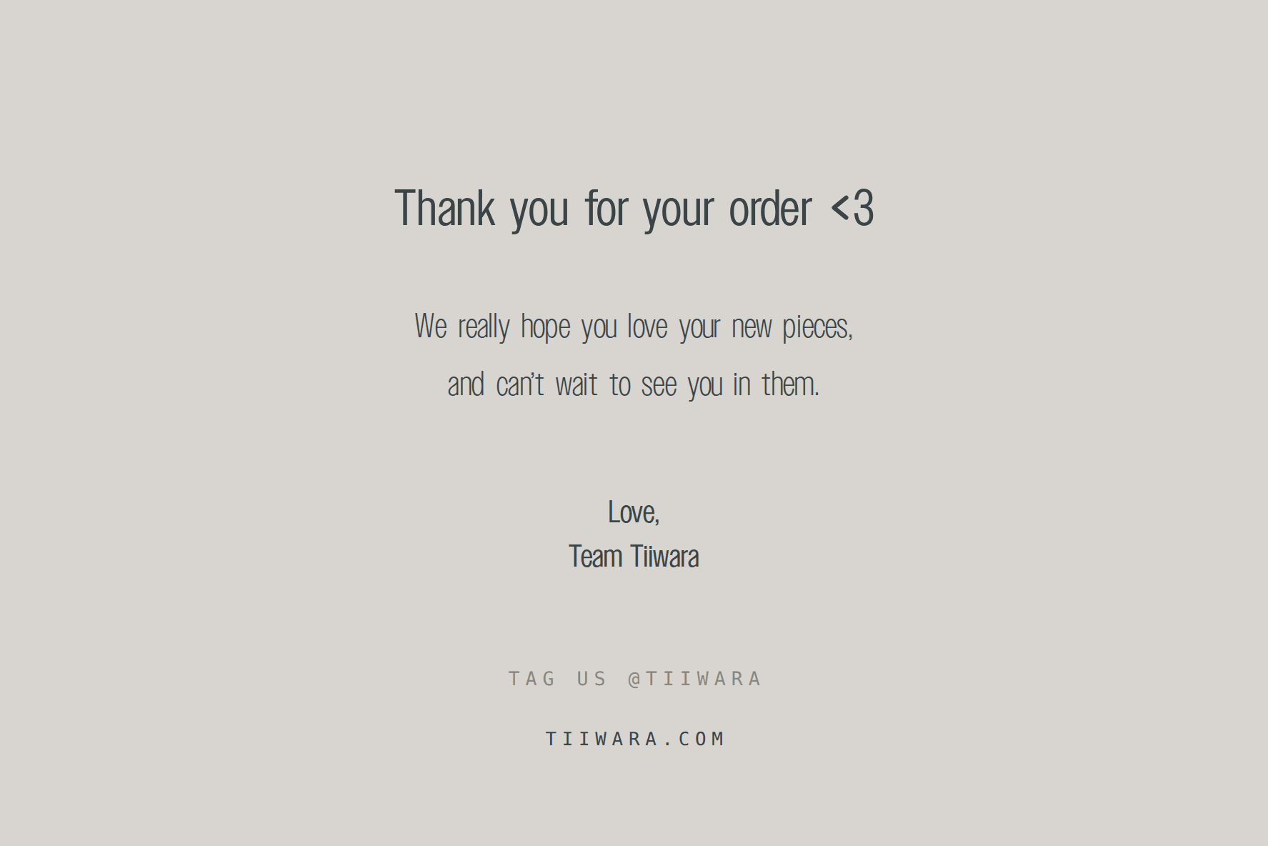
05 · Packaging.A slate mailer with the ii in powder, and a thank-you card with one front and two backs, for orders and for gifts.
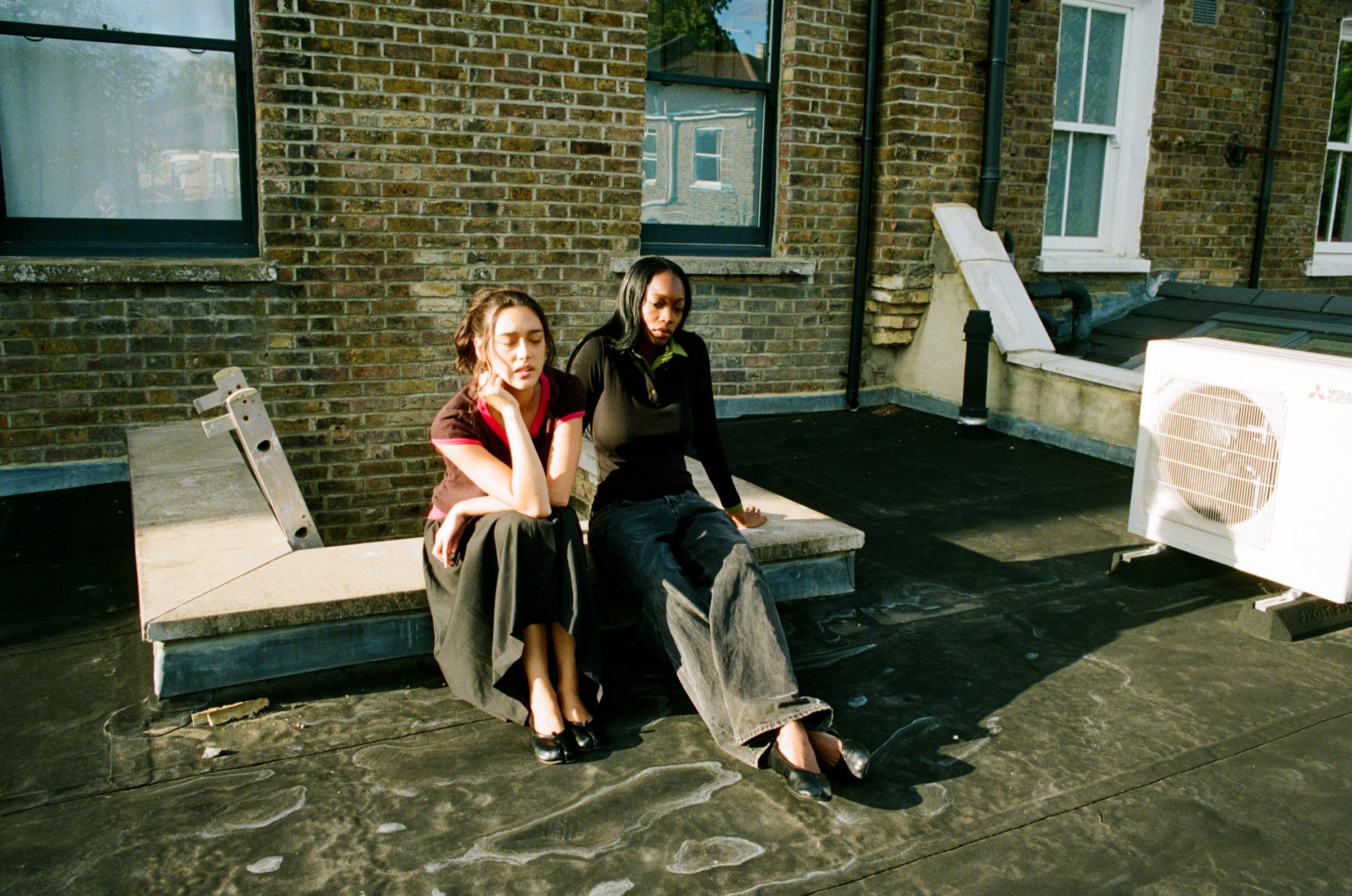
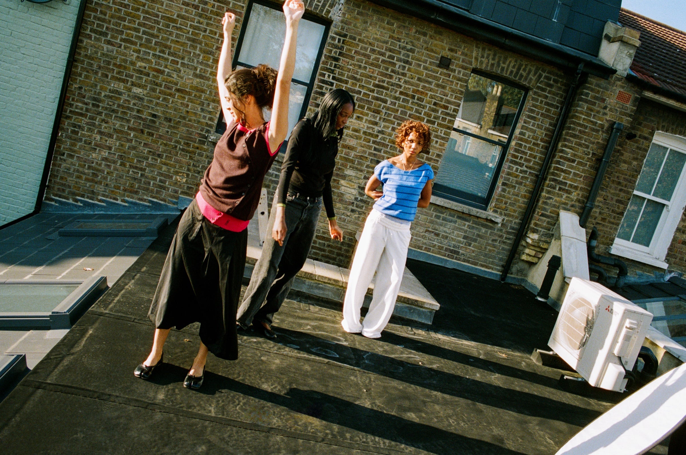
06 · In Office / Out of Office.One system with two settings became the site architecture. Waitlist emails, preorder week and the campaign all run on the same language.

- 500+ on the waitlist before preorder
- AW26 live on tiiwara.com, shipping from 6 November
Kimberly TcheCreative direction, identity, packaging, web design and build
Candice ShonaArt direction
Jarvis Sagau Laurence, OnethreefiveFilm
Year2026Services
IdentityColour systemPackagingWebsiteLaunch