Nourri
Nourrishment-grade skincare and haircare, made by a mother for women who were raised by one.
- CLIENT
- Skincare and haircare
- MARKET
- UK and Cameroon
- YEAR
- 2026
- SITE
- nourri.shop

Made by a mother,
for women who were raised by one.
01 · THE NAME
Nourri.
French for nourished, and a nod to the brand’s two homes, London and Douala.
The double r carries into the language around it: products are nourrishment-grade, the newsletter is Nourri’shed, and the hero oil is The Nourrishment.
Always two r’s.
02 · THE MARKSTwo marks. One identity.

The n, lifted from the wordmark and set inside a brass ring. For caps, seals, bases and stickers: anything round, small or tactile.
A script n leading a wide, flared OURRI, drawn as one artwork. For labels, cartons, windows and campaigns. Always use the supplied file.
02 · THE MARKSSpace, size and colour.
xx
CLEAR SPACE
x = the height of the O’s counter. Keep it clear on every side. Minimum width 24mm in print, 96px on screen.COLOUR
Bone on cocoa, cocoa on cream, bone on ember. Nothing else.
x = the height of the O’s counter. Keep it clear on every side. Minimum width 24mm in print, 96px on screen.COLOUR
Bone on cocoa, cocoa on cream, bone on ember. Nothing else.
03 · TYPEOne drawn mark. Two fonts. One rule each.
The Nourrishment.Product names, headlines and the founder line. Italic only, for warmth.
BATCH 001
100ML · BAOBAB · JOJOBA
EST. 2016Ingredient strips, batch marks and seal text. Capitals, tracked wide. The honest label.
04 · PALETTESkin, wax, glass, brass.
Cocoa
Bone
Ember
Brass
Cream
Alabaster
Ink
05 · THE HERO · SKU 01
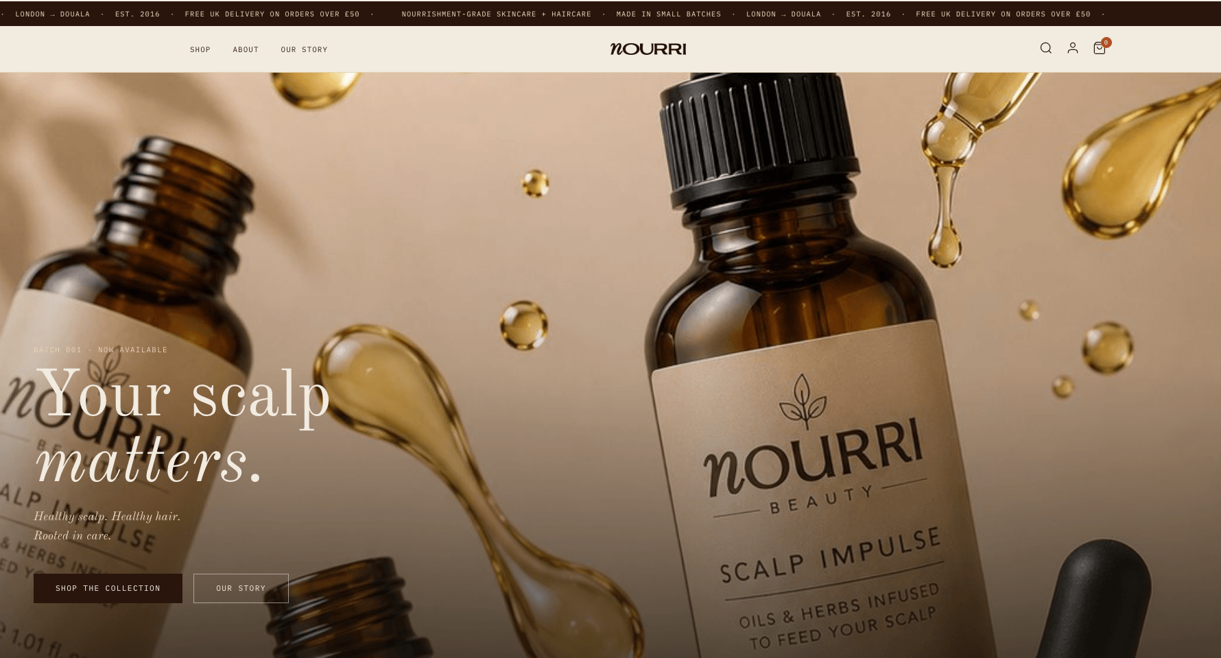
“I’m out of Nourrishment.”The hero oil is called The Nourrishment, so when she runs out, the sentence she says out loud has the brand name in it. That’s the anchor for the whole line.
FORMAT
100ML AMBER GLASSCLOSURE
BRASS PIPETTE + SEALLABEL
DEBOSSED BONE PAPERBASE
INITIALS + BATCH NO.
100ML AMBER GLASSCLOSURE
BRASS PIPETTE + SEALLABEL
DEBOSSED BONE PAPERBASE
INITIALS + BATCH NO.
06 · THE FAMILYA line that reads as one thing at fifteen feet.
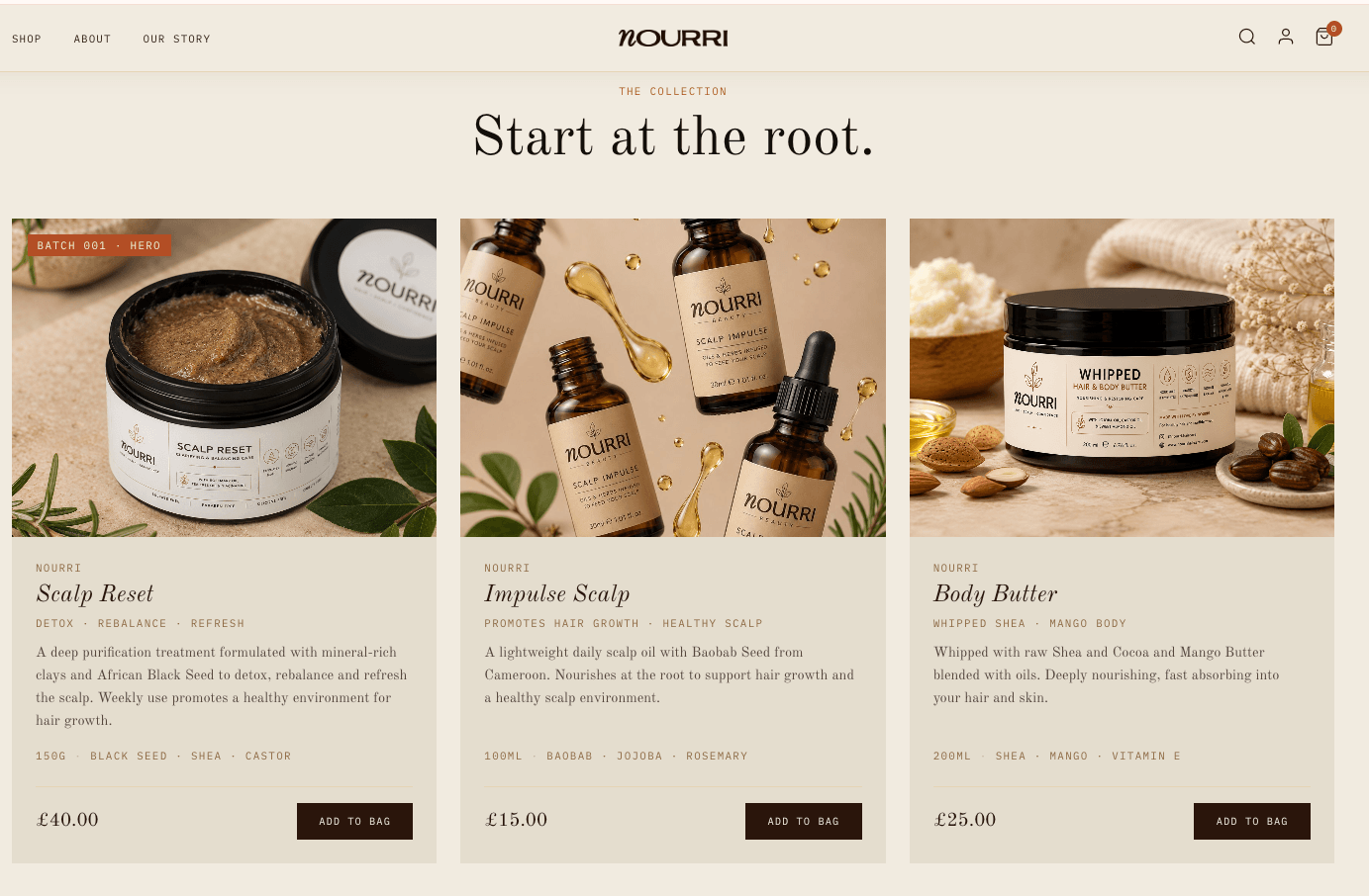
The Nourrishment
The Black Soap
The Butter
The Snail Serum
07 · THE FORMULATOR
Twenty-five years of craft, distilled into small batches.She is the brand’s spine, not its face. She formulates, batches and signs. The object tells her story, so the label doesn’t have to.
01Initials on the baseHand-drawn in cocoa ink on the underside.
02The line on the flap“Made by a mother, for women who were raised by one.”
03The seal on the capThe n in a brass ring, foiled on alabaster.
04A handwritten batch numberBatch, date, origin. Small enough to miss, deliberate enough to notice.
08 · THE STORE
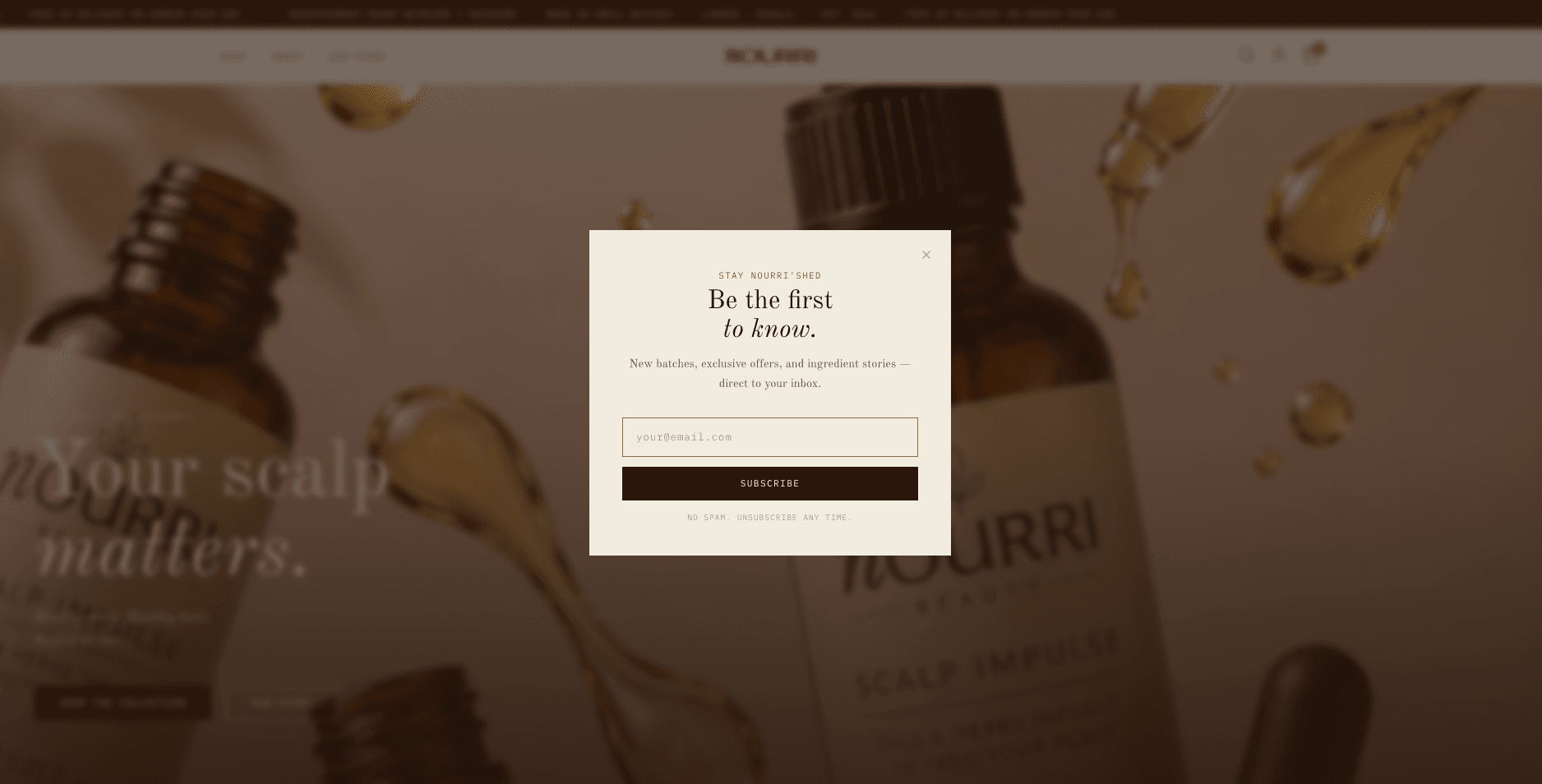
A store that starts at the root.
A Shopify build with its own collection pages, ingredient strips on every product and a newsletter that signs off “Stay Nourri’shed”.

Kimberly TcheBrand identity, web design and build
Year2026Services
IdentityPackagingWebsiteShopify